-------------
PINK. Feminine as F@*$!
Well, that’s what we typically think of when we think of pink. Are we right?
But hold up. We’ve got some news for ya!
Pink has a new look. No, not a new shade or a new trendy tone. But a completely new identity. And it’s not what you’d expect.
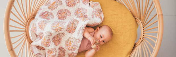
We can all agree that pink is one of the most gender-loaded of all the colours. We’re all aware of pink’s traditional associations. When we think of pink, we think of Charm. Politeness. Sensitivity. Tenderness. Sweetness. Childhood. The Romantic. The FEMININE.
You see the trend.
In the western culture, pink has been commonly associated with girls, as blue is for boys. Pink was first used as a gender signifier back in the 1940s, then followed to have strong feminist associations with women inspired movements and organisations as far back as the 1950s. And while these associations have generally been very positive, pink has forever maintained this sweet, sensitive image; just like below (pic via @ihavethisthingwithpink).

But, wait, things are shifting. Pink has a new complexion. And that complexion is bold, assertive and confident. And it’s no accident that the resurgence of pink is occurring simultaneously with the emergence of a gender-less generation.
So how did this come about?….
In November of 2015, Pantone made a bold statement with their duel announcement of Rose Quartz and Serenity Blue (a chalky blue) as the colours of 2016. While, it was suggested these soft, passive colours were a representation of the wellness movement of that moment, it seems that Pantone was also making a statement of their own: That pink was no longer just for girls and blue for boys!!
Fast forward two seasons, and we witnessed the most amazing colour saturation of the fashion and design worlds by one colour that’s been seen since cerulean blue ignited back in the early 2000s.
Whether you call it Rose Quartz, Millennial Pink, Tumblr Pink or Scandi Pink, we’re all in agreement that this colour is one of the most impactful colours of the last decade. So omnipresent, that it has become the mascot of an entire generation.
This soft soothing colour, somewhere in between blush pink and salmon, is claimed to reduce stress, suppress aggression and calm the nerves. Closely related to Baker-Miller Pink (see below, pic via SNOOP, www.heartanddesign.blogspot.com.au), a colour that scientific research has long linked to the above positive behaviours. Kendall Jenner is a believer, with the star recently cited as having painted her entire room in this colour in order to suppress her appetite and regulate her mood.

Millennials can’t get enough of it. From Vans Old Skools, Gucci runway shows, iPhones to the endless backgrounds of Instagram slogans. It’s saturating our hearts, our minds and our social media accounts. Companies are making considered decisions to use this colour within their branding – think Acne, Glossier, Le Creuset and Everlane. And in doing so, they’re helping to change the public’s perception of pink, and in turn, its feminine associations.
Pics below via 1.darcie wilder, twitter.com; 2.Charms SS2017, www.malefashiontrends.com


So what does this mean for us? And where is our dear PINK headed?
It seems that the popularity bubble is not bursting for this “new image” pink any time soon.
Though colour forecasters are now predicting that next season will see a pink of a slightly lighter, softer shade (though not baby), or a little bolder in the other direction (though not hot pink). Think Aurora pink, taffy and gravadlax.
So, all you pink lovers out there (and those of you who are still on the fence), the PINK ride is not over just yet.
And here at Study of Colour, we’re not complaining.
We’ve been following this pink movement for the last few seasons, and we see that this powerful colour has much more to give. The emotions that this “new era” pink are evoking are very powerful and affirming.
And while, not all of us are brave enough to go wall to wall with this colour, introducing little pink pops of colour into your home, will only have positive benefits.
For instance, a bold, bright pink sofa or chair adds a pop of colour and a statement that is not too overpowering. Couple with earthy tones like the below example (www@love-your-home.co.uk), or contrast against a soft neutral palette with bright interior, ensuring that your statement shines as it should.

Conversely, a blush pink cushion or side table can add a soft touch and sooth the senses without throwing out the whole room. See below (www.studiooink.de).

And if you have it in you, go wall to wall like the below example (www.fermliving.com), and see the difference that this has on your stress levels – it’s been scientifically proven!

And there’s more where this inspo came from.
So stay tuned to our Insta @studyofcolour over the following couple weeks, as we explore the meaning and benefits of pink and share our THINK PINK tips for styling with this shade within your own home.
SOC